
Slicing the Atmosphere: Finding the Pattern Hidden Inside the Daily Average
What can we see by looking at the same hour of the atmosphere over several days that we cannot see in a daily composite? If we are looking at variables with a strong and repeated diurnal variation like temperature, a daily composite averages out the highs and the lows. For a single day, looking at just an afternoon temperature window for high temperatures makes sense. But we can also look at the hottest part of the day across several days, especially when we have persistent weather patterns.
What can we see by looking at the same hour of the atmosphere over several days that we cannot see in a daily composite? If we are looking at variables with a strong and repeated diurnal variation like temperature, a daily composite averages out the highs and the lows. For a single day, looking at just an afternoon temperature window for high temperatures makes sense. But we can also look at the hottest part of the day across several days, especially when we have persistent weather patterns.
Viewing Persistence patterns over several days
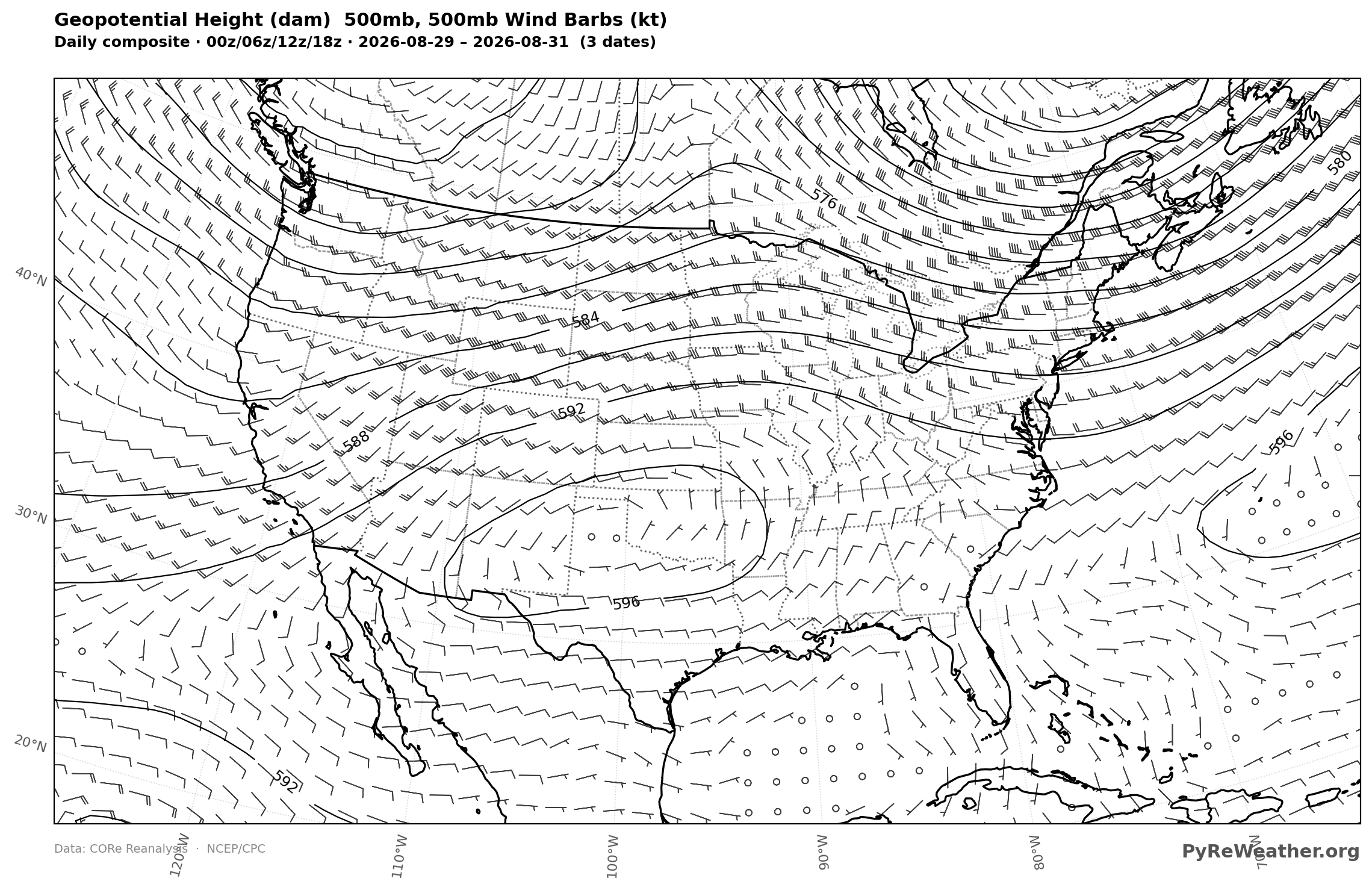
Summer persistence patterns are common with high pressure ridges, but even still as the summer days pass, those ridges will generally march eastward bringing a new wave of low pressure systems and mid latitude cyclones only to be replaced a few days later by another persistent pattern. During the last several days of August, 2026 we had this exact pattern. A quick way to verify is to look at the daily composite of the 500mb pressure levels over the 29th, 30th and 31st. If the pattern is somewhat static, long waves will remain in place as meridional patterns. If it's changing quickly they will average out into a more zonal pattern.
Pyre Weather Settings for 500mb Daily Composite
For map settings make sure that the time-scale is set to Daily, Date Mode is set to Range and the date ranges are set to August 29, 2026 - August 31, 2026. For Variable the 500mb Geopotential heigh will give us the best information about the synoptic patterns, but you could check any variable for this date range and see what it looks like. Choose CONUS (Continental United States) for the Region, and optionally overay wind barbs (it takes about 20 seconds longer, but it's a nice addition). Height will be automatically selected in overlays since we are viewing the 500mb height level.

PyRe Weather Settings
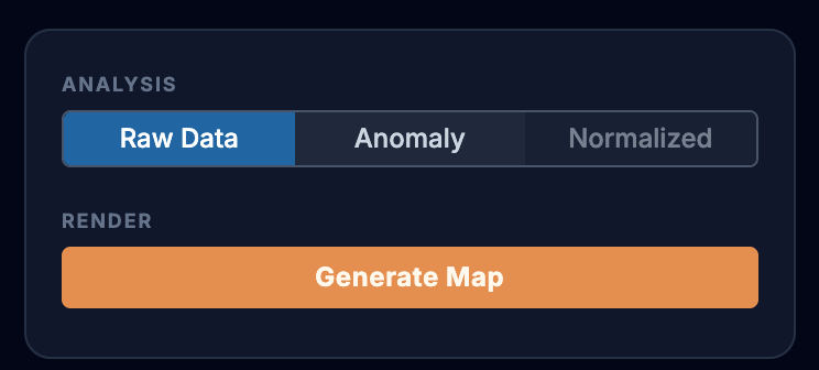
Once your settings match the image above, click the Amber "Generate" button, making sure you are looking at "Raw" data (selector just above the generate button).
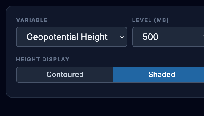
If you want something more colorful, just regenerate using the "Shaded" option under the 500mb height selection:
You should see a map that looks just like this one! Notice that after the bold title on the top, the subheading reads "Daily Composite 00/06/12/18" Followed by the date range. This tells you that the map is made up of the synoptic windows for each of the 3 days, or a total of 12 windows, all averaged together.
500mb Geopotential height, Daily Composite Aug 29-Aug 31, 2006
Once we've established that there is a persistence pattern in place, we can look at the diurnal patterns across the three days. In this weather pattern, one of the most obvious features is the persistent heat beneath the ridge. It's impressive to me how high that hot air ascends - it's not just limited to the surface temperature.
Diurnal Temperature Variation at 850mb seen in 3-Hourly Maps
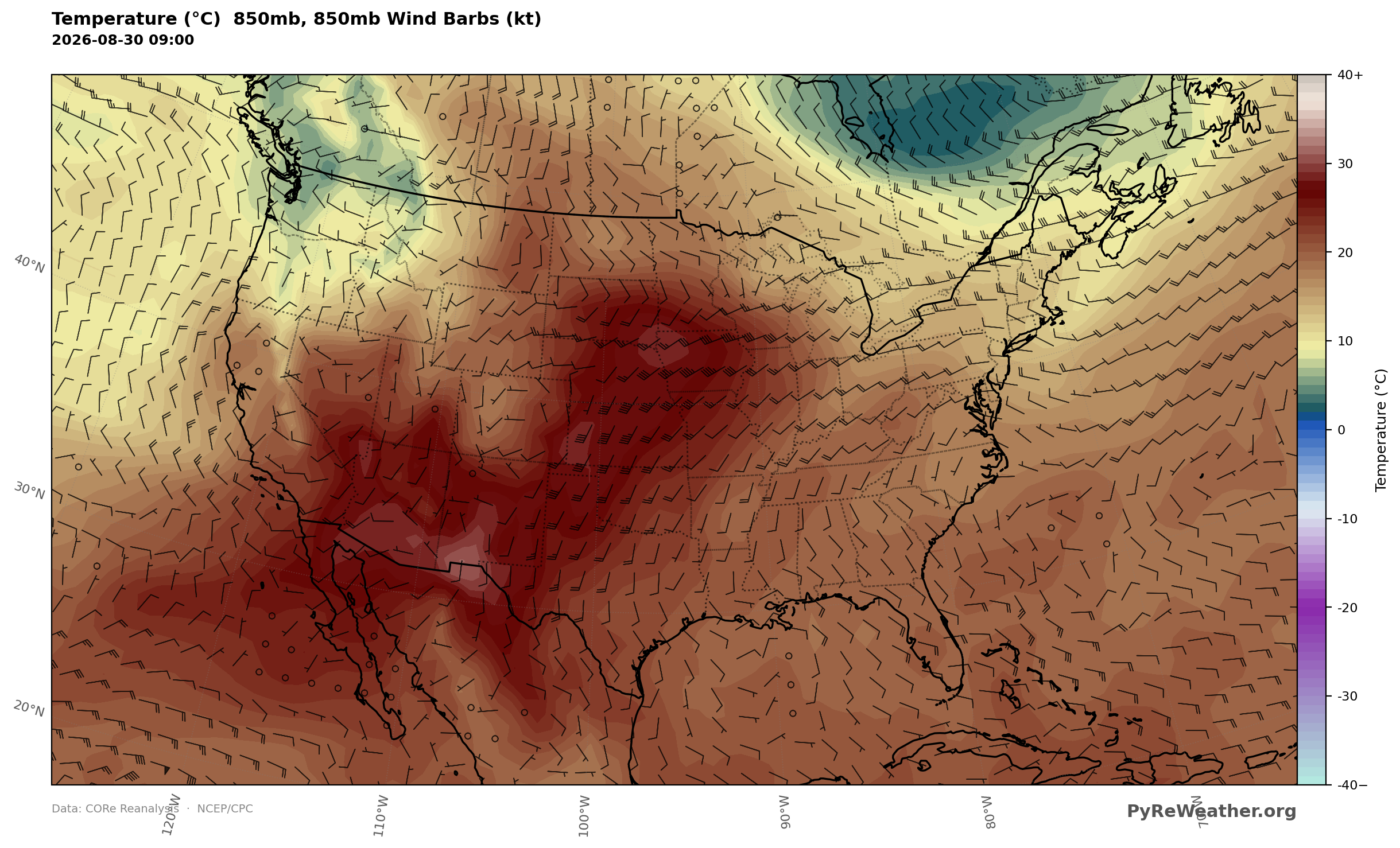
Even at levels above the surface, temperature has a lot of diurnal variation. Lets just look at one of those 3 days at 12 hours apart at 850mb. While the US covers 4 time zones and it's not easy to get "dawn" and "afternoon" maps for all zones at once, we can at least get a pre-dawn view of the whole country as well as a good pre-sundown view.
850mb temperature (C), Aug 30, 2026 09Z
850mb temperature (C), Aug 30, 2026 21Z
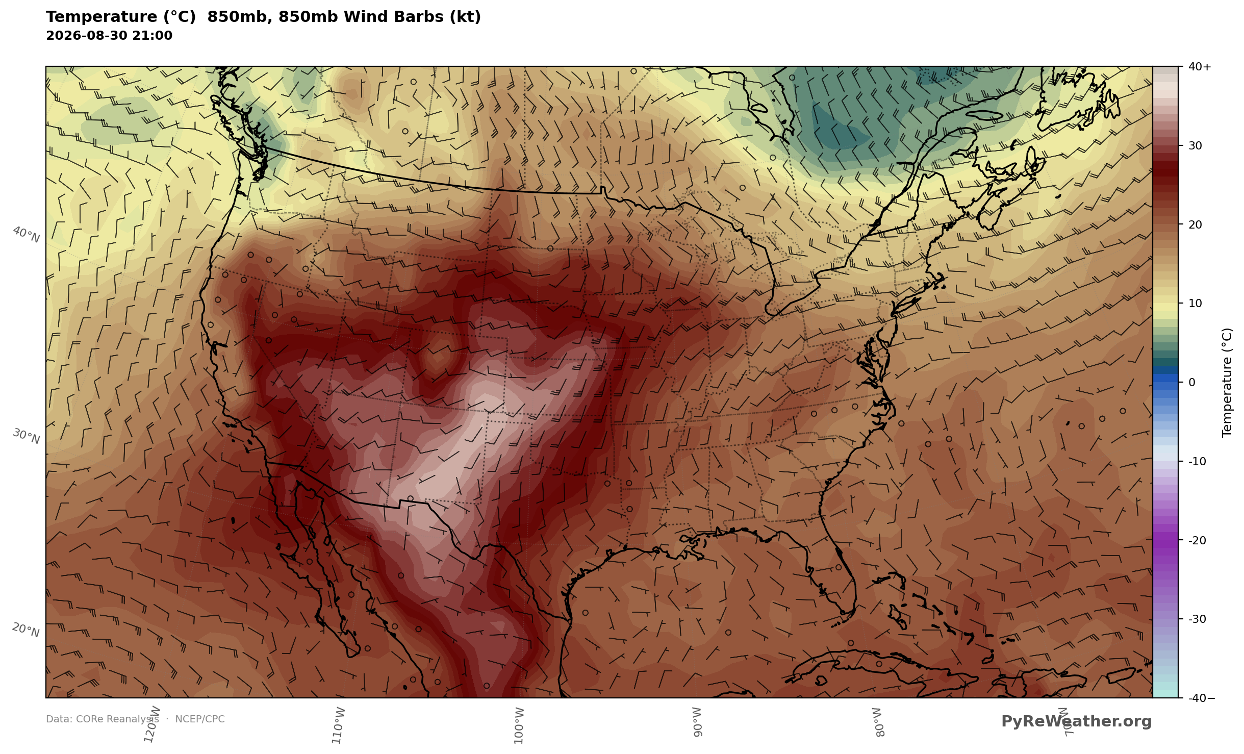
You can see the dramatic increase in even 850mb temperatures in the afternoon at 21Z. While it may not be the hottest part of the day in all areas it's clearly much warmer in the afternoon than before the sun rises. (One caveat with 850-mb maps is high terrain. Across parts of the Rockies, the land surface itself is above the 850-mb pressure level. Reanalysis data are produced on terrain-following model levels and then interpolated to standard pressure surfaces, so values shown at 850 mb over high mountains are model-derived rather than temperatures from an atmospheric layer physically above the ground. Those areas should therefore be interpreted cautiously.)
Daily composite maps average the four synoptic times
A daily composite map for the same date averages all the synoptic times, and is still representative but not as specific for the warmest parts of the afternoon
Daily composite, 850mb temperature (C), Aug 30, 2026
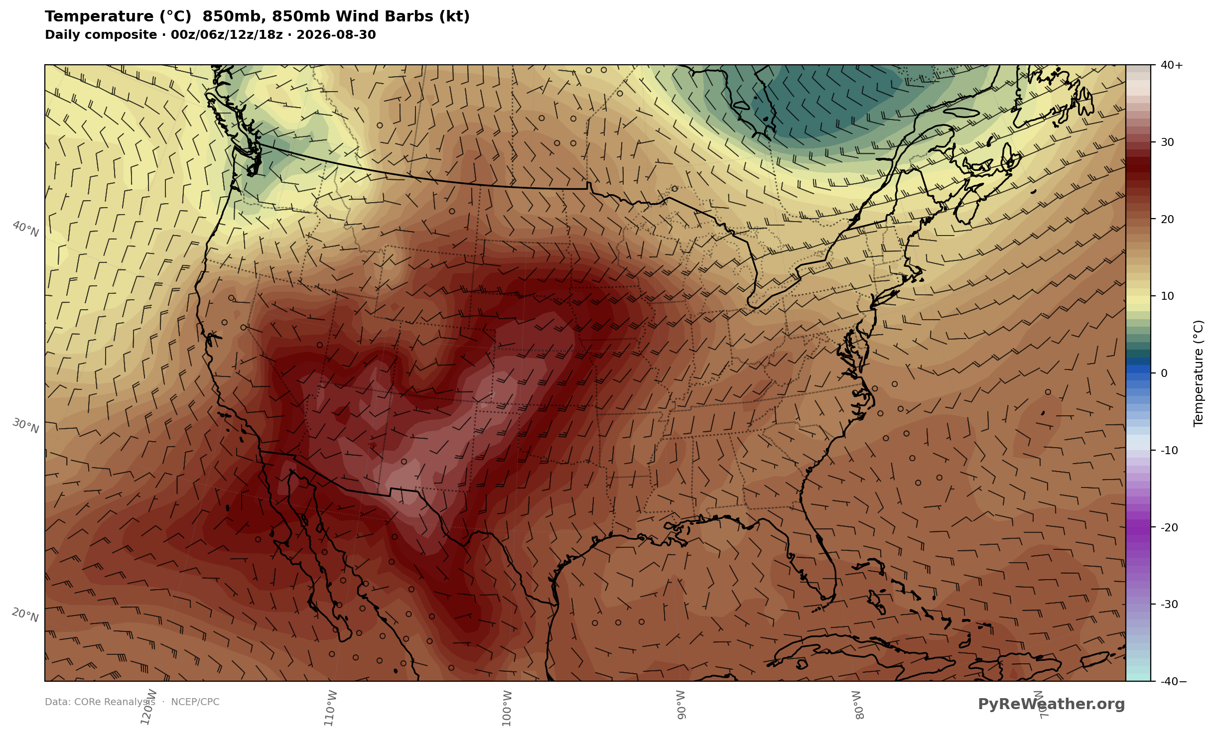
3 Day Daily Composite averages all synoptic times over 3 days (12 synoptic times)
What if you wanted to take at the heating for those 3 days which we've already shown have essentially the same or very similar synoptic setups. We could guess that a daily composite of the 3 day swill look a lot like the single daily composite here.
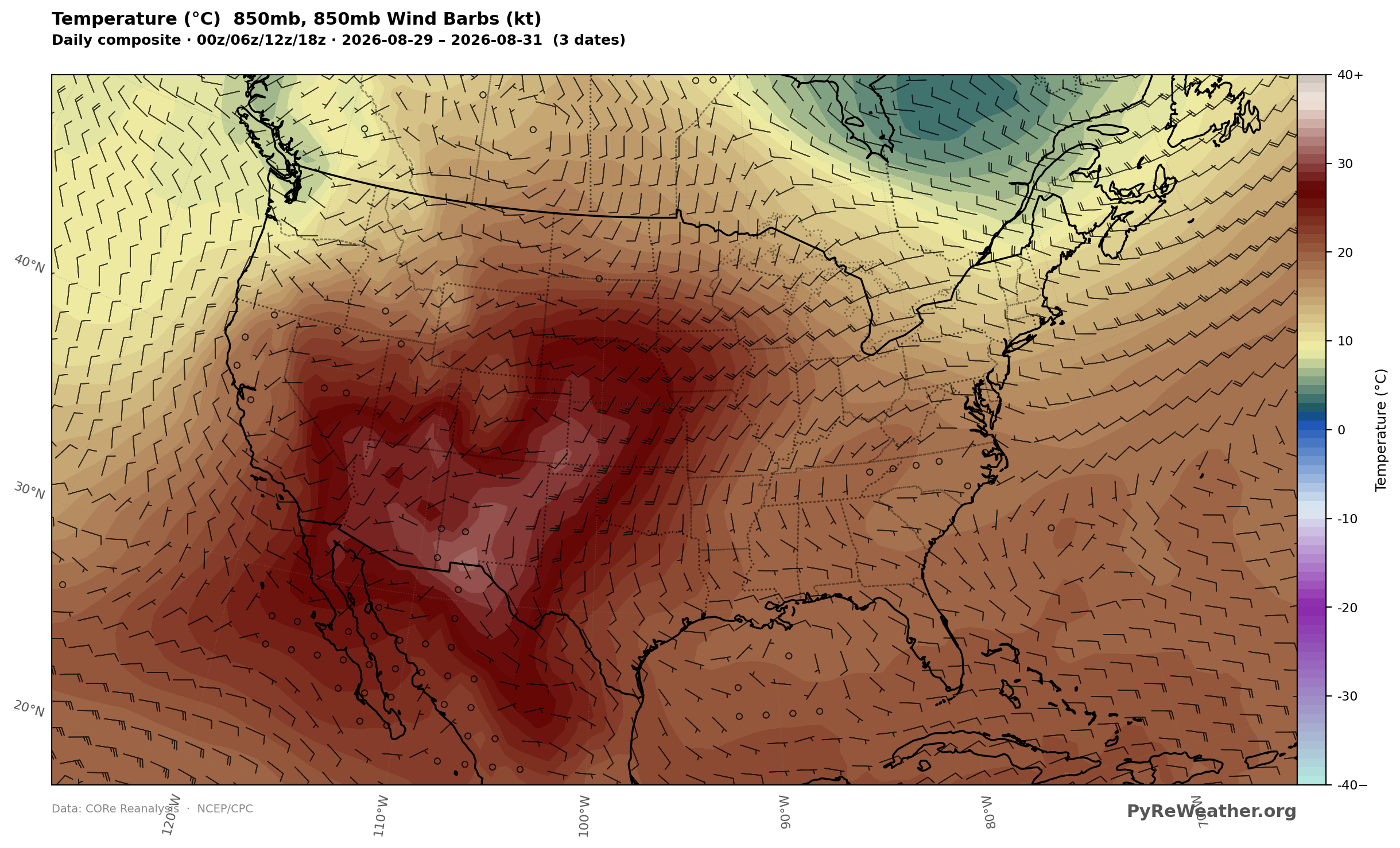
Slicing out the afternoon temperatures
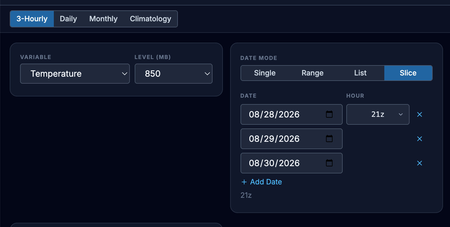
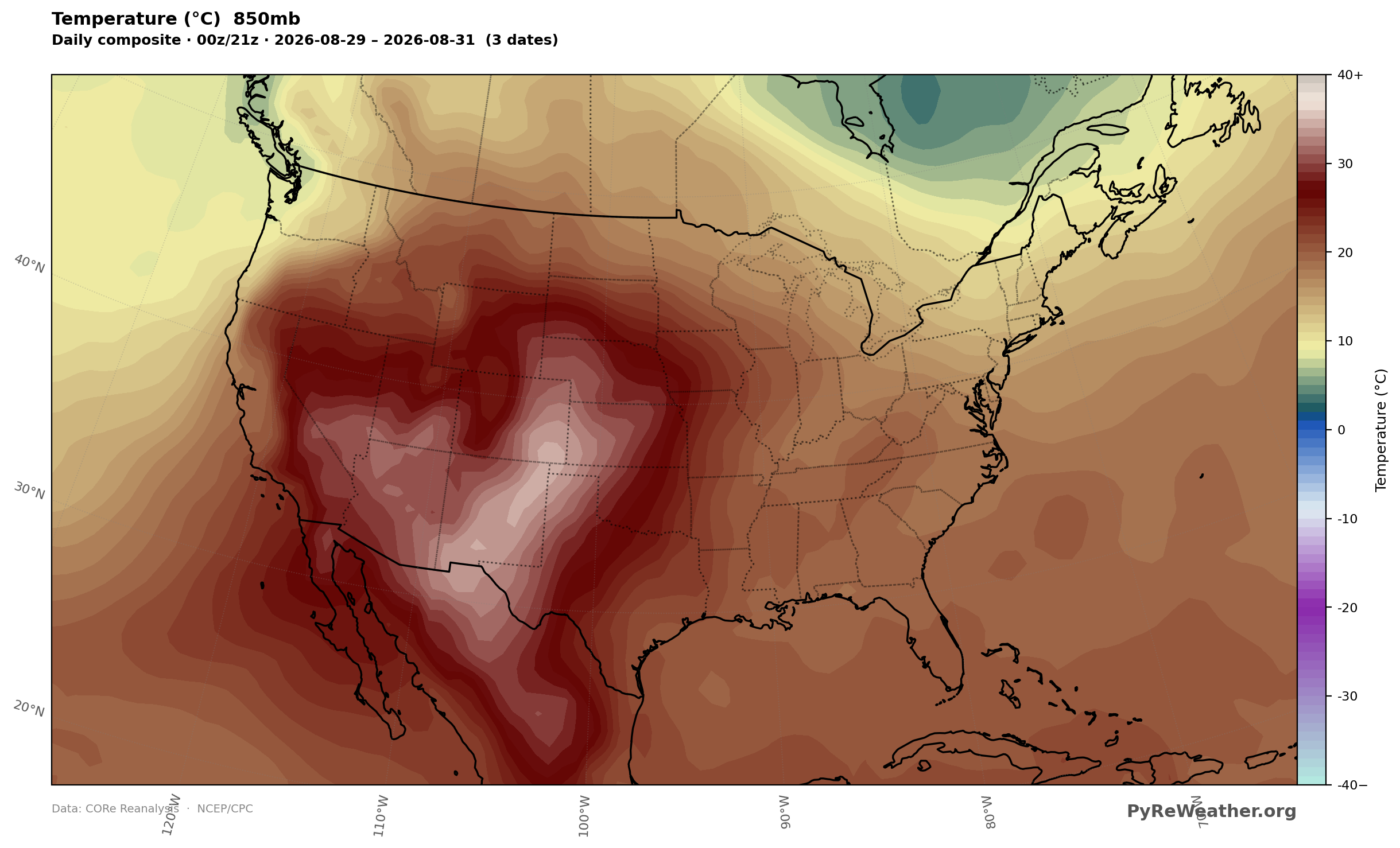
Now lets only look at the afternoon heating for those 3 days, and we now we are looking at a composite of the 21 Z 850mb temperatures, rather than the daily composite. We've taken into account the diurnal nature of temp and are looking at the hottest part of the day in general. In order to do this, switch the date mode to Slice, and then choose the Z time you are interested in (21Z in this case) and then add the dates that you want to composite. (Currently for Slicing you will have to "list" the days 1 by 1).
As expected this composite shows much more focused concentration of heat in the southwest, even more so than the single day we looked at earlier. Together with the persistent 500-mb ridge, this shows that the warm lower-tropospheric pattern persisted across the three afternoons.
Composite Slice, 850mb temperature (C), Aug 29-31, 2026 21Z
How unusual were the afternoon temperatures at 850mb on this day?
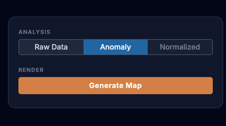
Purely for the sake of the beautiful maps we can create, but also to answer the question of whether or not this is normal for late August in the late afternoon, we can look at the composite anomaly for the slice of these 3 days at 21Z ... how much warmer / or cooler was it than normal? In the builder settings, switch from Raw to Anomaly.
(Normalized anomalies are temporarily unavailable for 3-hourly slices while we finish precomputing the required climatologies.)
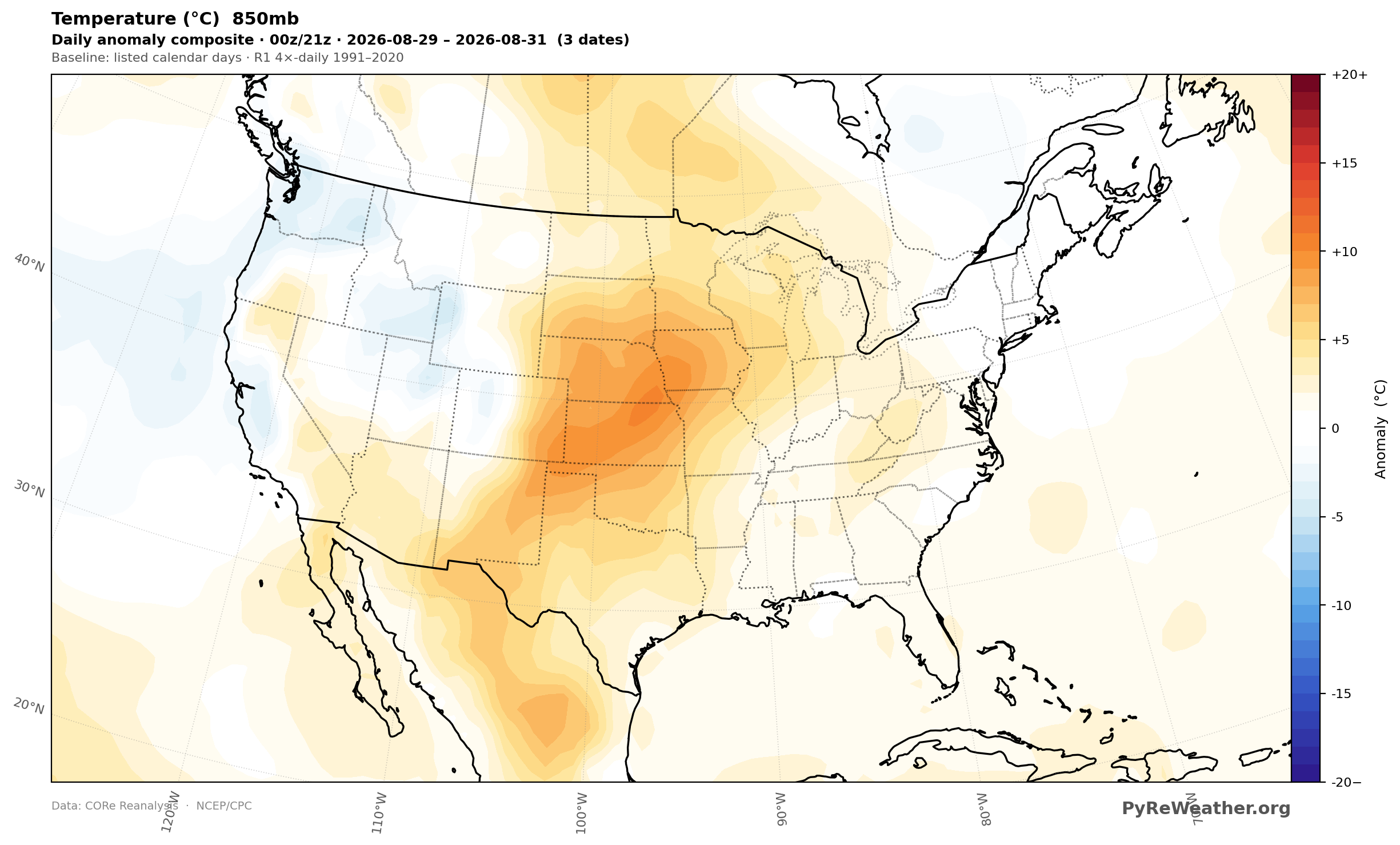
We can see the swath of Warmer than normal air at 850mb under this heat dome in late August 2026. Even without the 500mb pattern overlaid, the warm anomaly closely echoes the broader large-scale pattern we saw earlier. I think the pattern shown here is just gorgeous with the swath of higher than normal temperatures sweeping up from central Mexico, through the American southwest into the northern plains. But the real question is whether or not this pattern was significant for the weather that occured over those three days. I'll discuss that in the next two articles, but if you want a preview you can take a look at the SPC storm reports for those days as well as the NWS Flash Flood Risk reports for the Dragon burn scar in Northern Arizona.